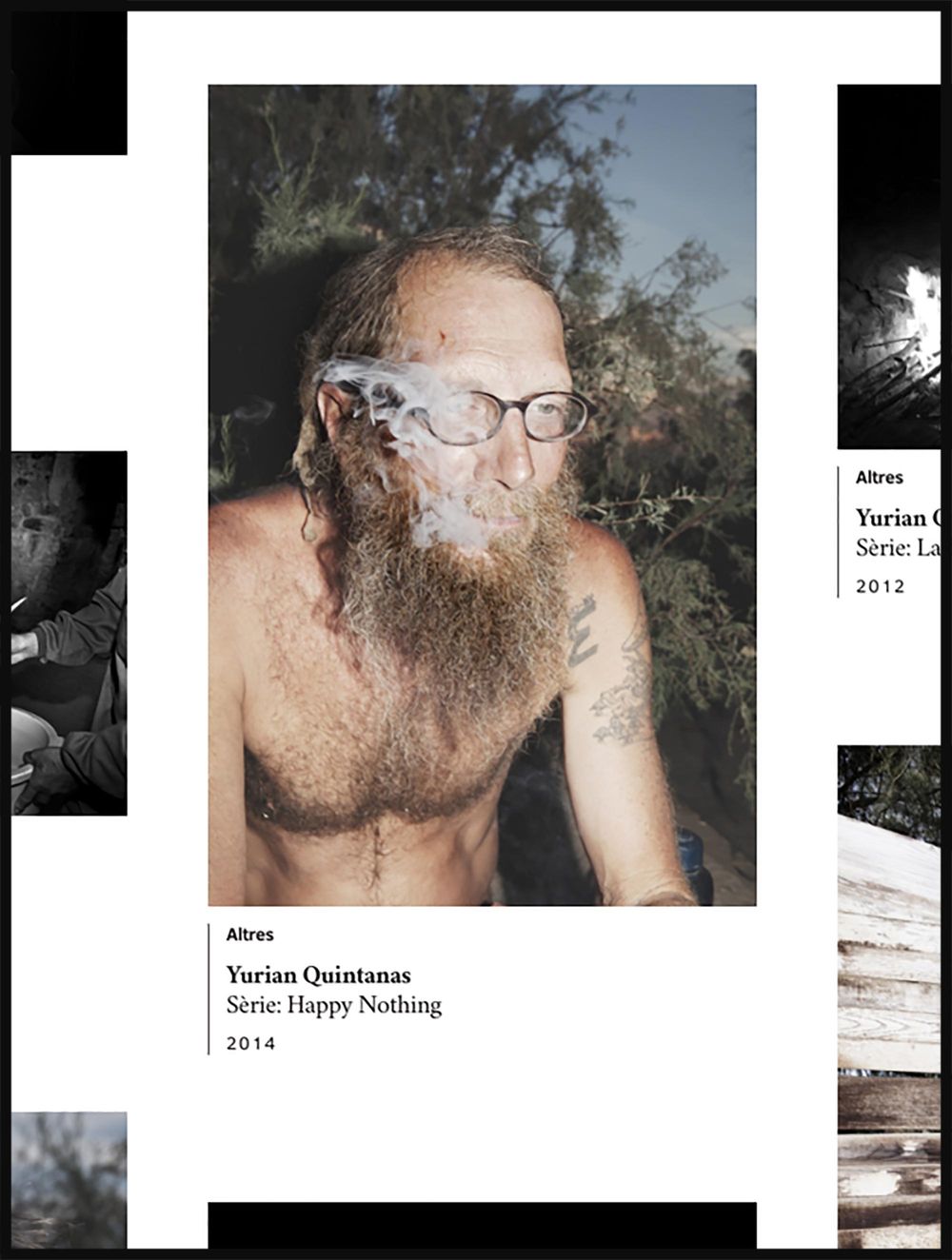
Barcelona Contemporary Culture Centre — CCCB
The CCCB is a cultural centre in the city of Barcelona that, thanks to the quality of its broad programming, production and creation, has become a cultural benchmark on the international scene.
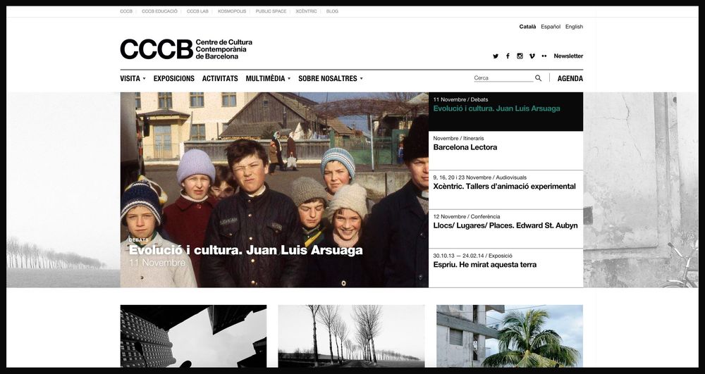
At DOMO—A we developed the CCCB’s design and website prototypes.
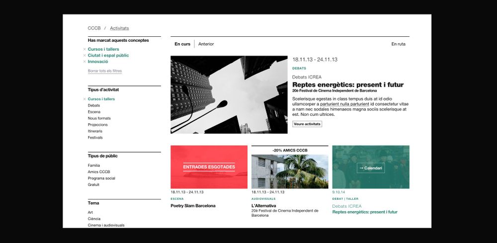
Applying contemporary aesthetics, and fully aware of the great documentary and academic importance of the content that is produced at the centre, we established the typeface and the hierarchy of the texts as well as the features of the website so as to achieve a more satisfactory user experience.
The project, both meticulous and complex, involved an expansion of the CCCB’s previous identity and work on how to develop and apply it, when necessary, to both physical and virtual environments.
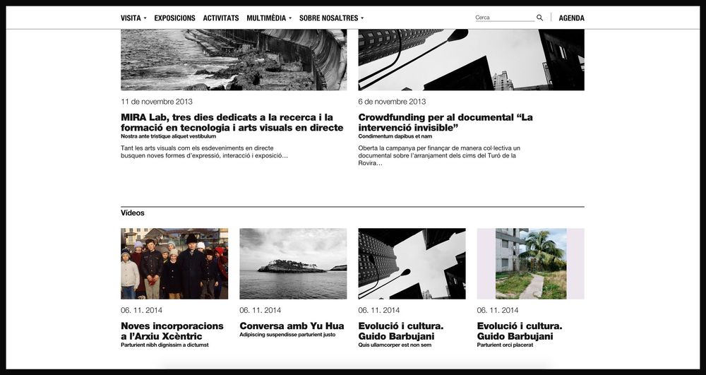
An initial analysis of the CCCB’s identity allowed us to pinpoint the use of a number of resources that we then applied to the website environment.

The identity
The logo always appears under the name of people or information, indicating that the CCCB does not have a hierarchical structure but rather that it is at the service of people. This idea was transferred to the website’s header. For us this was a very significant decision as it allowed us to create, in visual terms, a rectangle within the header that helped us to then distribute the side elements.
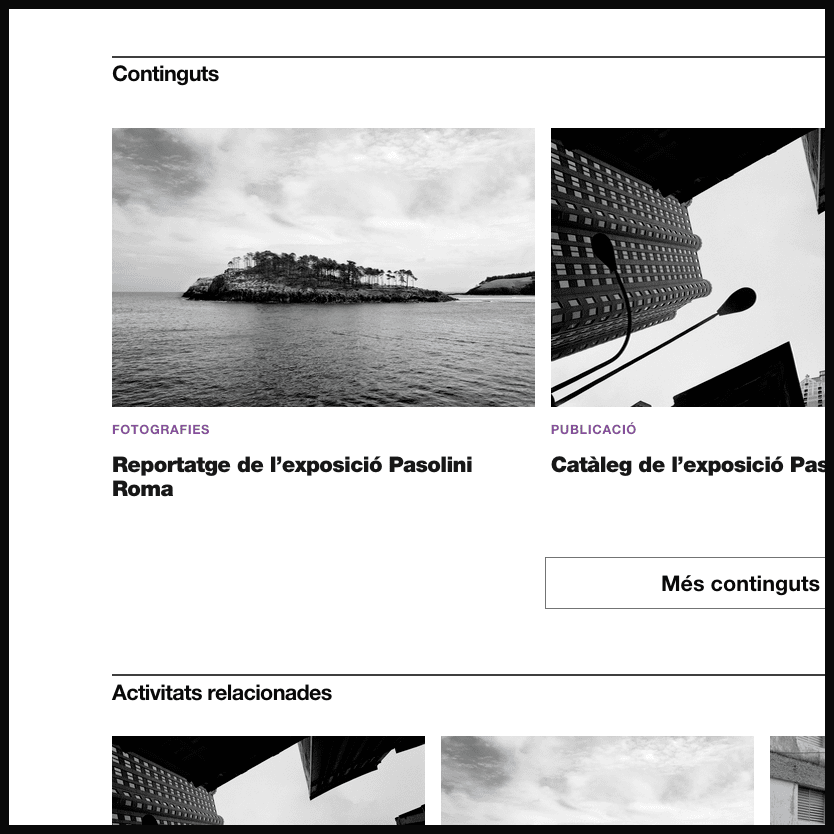
Graphic resources
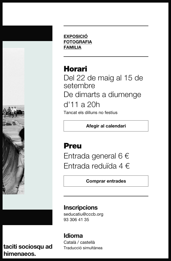
The use of bars and blank space is another constant in the CCCB’s identity. The concepts between sections tend to be separated by bars and always, either above or below these, there is a blank space that helps make the page more readable, encouraging an optimum reading pace.

Typography
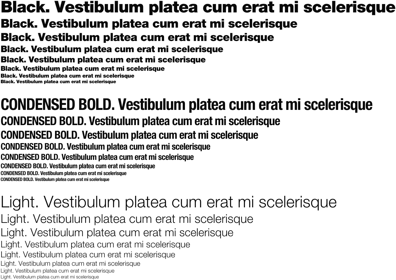
The contrast between the typeface sizes and weights generates a visual code that allowed us to organise the content in a restrained yet forceful way. This meant we had to use a broad range of weights within the font-family. Helvetica has a wide range of weights and this helped us find solutions to various problems, for example, for the upper menu, Helvetica condensed helped us to create greater visibility and to define it as part of the upper navigation zone.
Hierarchy
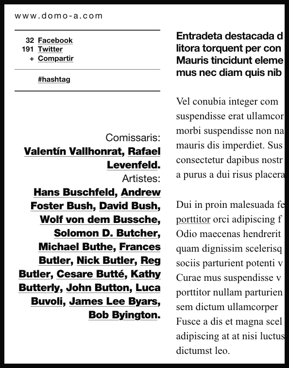
We used text boxes to structure different content levels, to help break the monotony and to be able to achieve the infinite formulas that we needed to display the very diverse information included in the entries or posts.
Photos by Pep Escoda.
