El Teler de Llum
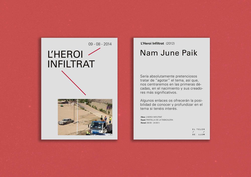
El Teler de Llum (Tarragona Art Centre) seeks to explore how to draw contemporary art closer to the public based on the opening of new exhibition formats. At DOMO—A we created the centre’s identity that is expressed using different formats and materials.

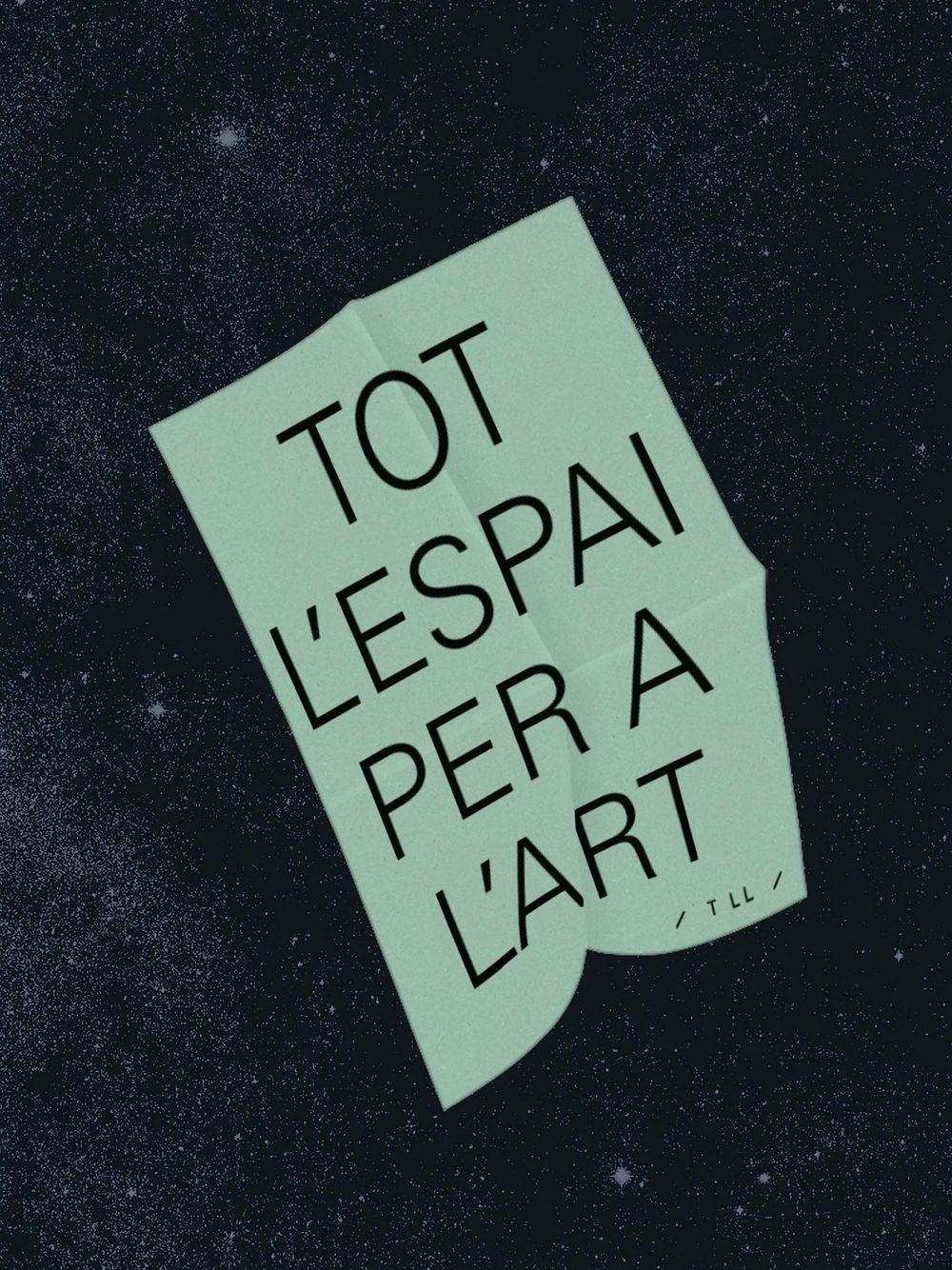
Brand claim
El Teler de Llum places the city and all virtual media at the service of artistic experience. Instead of there being a single specific exhibition venue, any corner of the city is susceptible to being included as part of El Teler de Llum. The brand claim emphasizes this fact and reasserts how art is capable of transforming reality and transmitting human stories.
Identity is action
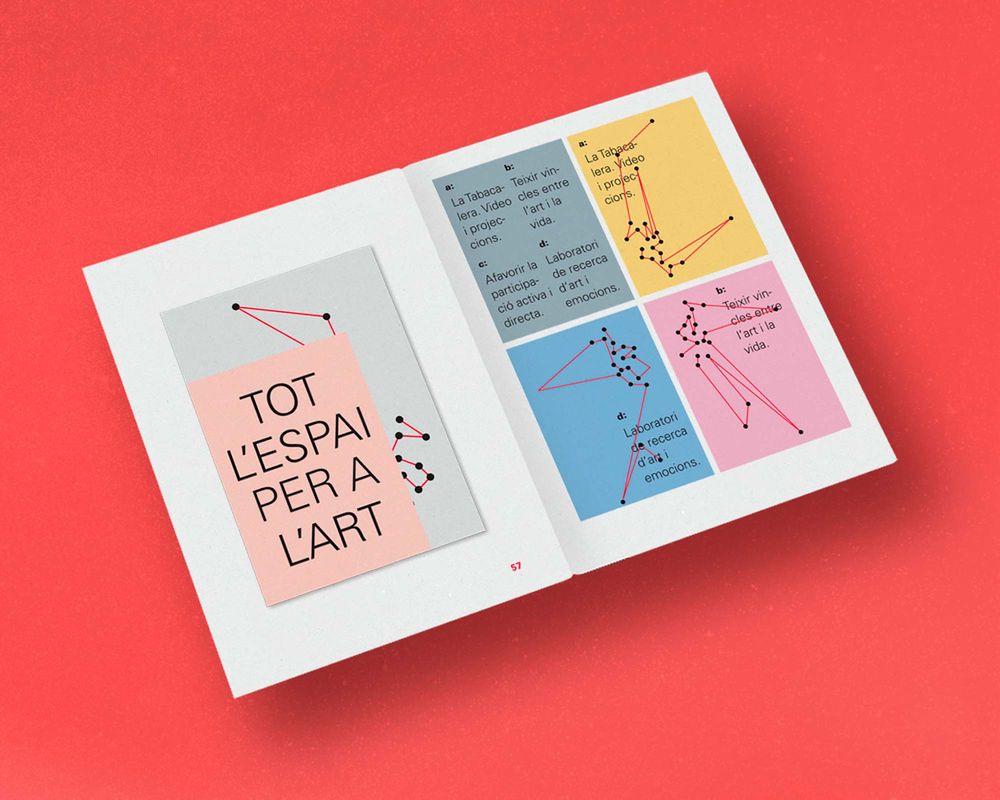
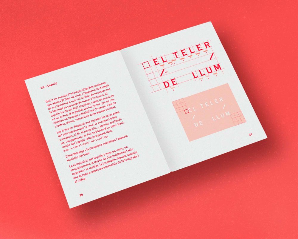
Corporate image
Considering the diverse nature of the projects that El Teler de Llum encompasses and the broad spectrum of citizens to whom it is targeted, it’s necessary to envisage identity in an inclusive way. The logotype should be easy to apply and capable of coexisting in an environment full of human experiences that manifest themselves in a multiplicity of formats and disciplines.
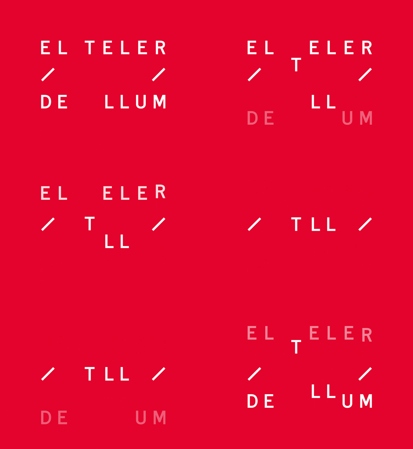
To understand the thinking behind the logo, first we need to know that El Teler de Llum literally means “the loom of light”. The diagonal lines that separate the two parts of the text represent the union, the connection between concepts, the thread, the projection… and they provide depth, suggesting the outline of a loom. The animation of the logotype strengthens this idea.
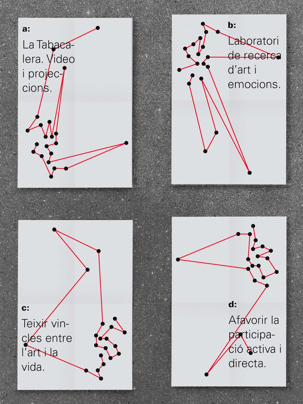
Communication is a constellation and we express this through the different physical and virtual formats. Graphically, the line represents the yarn on the loom that eventually weaves the fabric, the network. The knots of the fabric are the intersecting points between the lines. Based on this idea we created several applications.
